A Transfer Co. medallion references a transit token while the interior “T” expresses a continuous, connected path. A hefty slab serif was custom drawn to convey Transfer Co.’s mechanical history as well as complement the building’s low proportions. Supporting type references vintage bus roll type.

Signage package includes projecting signs and stand-up numbers and letters atop modern entry canopies by Clearscapes. Inside at the T Co. house bar, a brass “T” floats in front of a wood-formed concrete bar front.


Transfer Company’s open columnless plan is made possible by impressive trusses connected by massive plates. These have been referenced in a supporting mark which outlines the three tenets of Transfer Co.’s mission: Food, Knowledge, Community.

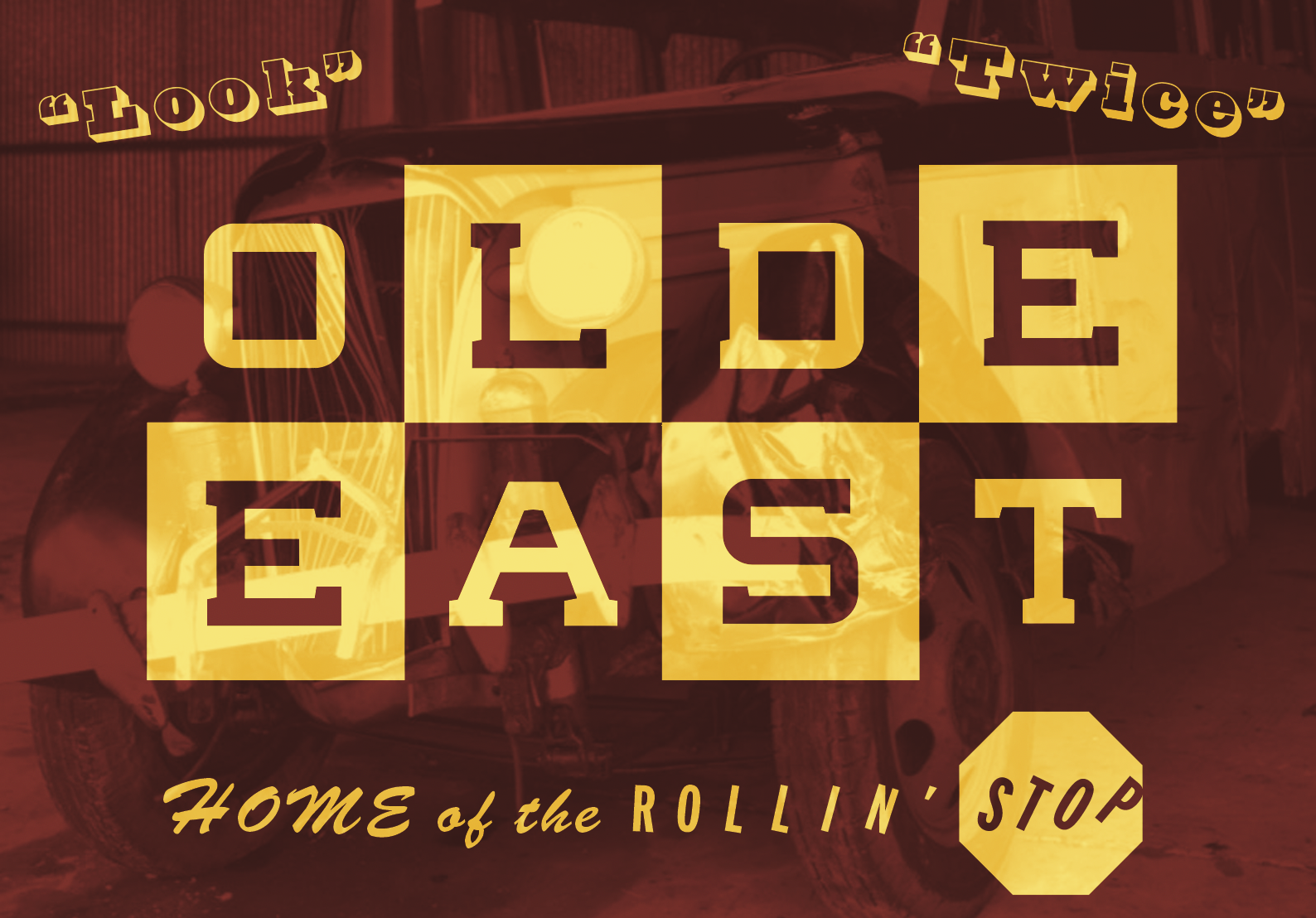
Transfer Company sits on the western border of Olde East, an often overlooked neighborhood just a quarter mile from downtown Raleigh. Instead of branding a large service door facing downtown, the project team decided to use that opportunity to welcome visitors to the neighborhood. The custom slab serif previously reserved for the logotype was extended for Olde East’s use.