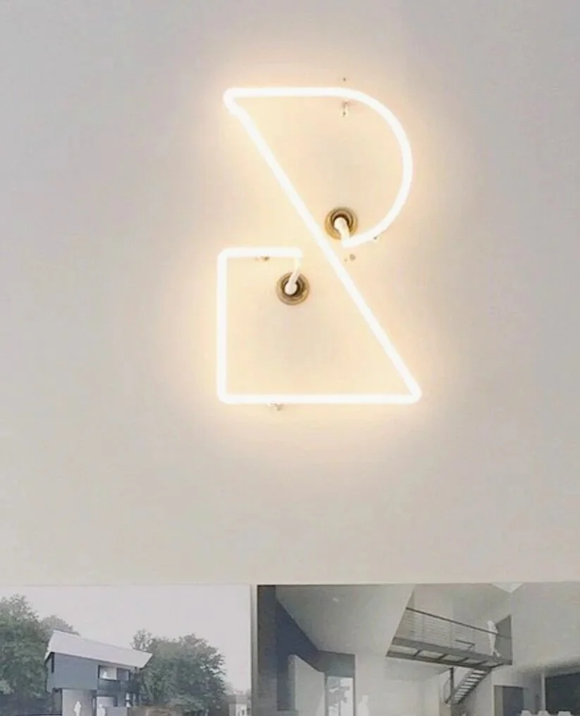


Design details include plasma-cut Corten steel signage, crisp white neon, and letter pressed business cards with yellow edge painting,

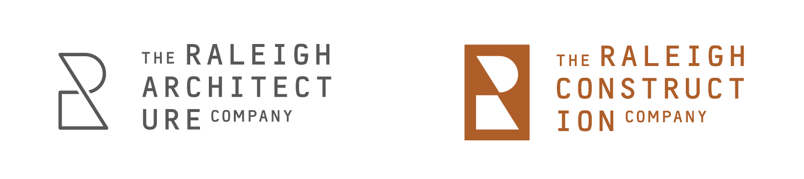
With the addition of the Raleigh Construction Co. a visual dichotomy becomes clear as the architectural mark expresses intention through line and the construction mark conveys the manifestation through fill.